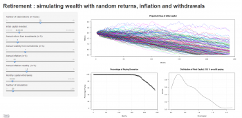
Edit investment parameters to see retirement finance projections up to 20 years in the future.
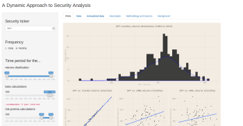
Dynamic Security Analysis
Calculate and visualize important financial metrics for any publicly traded security.
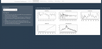
Economic Dashboard
Automated macroeconomic data analysis and forecasting, including automated commentary.
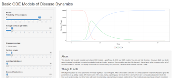
Disease Dynamics
ODE models of disease dynamics, allows for births and deaths, latent periods, and seasonal fluctuations.
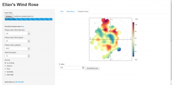
Wind Rose
Buildwind roses and pollution roses with your own data, or a sample data set.
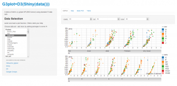
Intel g3plot API
Demonstration of Intel’s g3plot API with built-in sample R data sets.
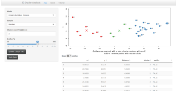
Outlier Analysis
Explore how different algorithms identify outliers in data.
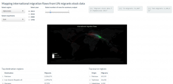
Mapping Migration
View maps of worldwide migration flows to and from regions, based on UN data.
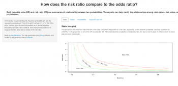
Odds Ratios vs Risk Ratios
Graphically explore how odds ratios relate to risk ratios and their probabilities.
Reconstruct Gene Networks
Visualize a gene network in a provided data set, or upload and explore your own data.
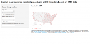
Medical Procedure Costs
Average cost and number of procedures performed for the most popular medical procedures.
Odds Ratios vs Risk Ratios
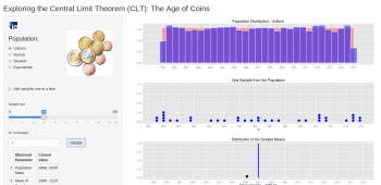
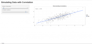
This app implements a simulator for the Central Limit Theorem (CLT) based on the example of the age of euro coins.
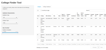
College Finder Tool
Create a table of US colleges sorted to match admissions criteria.
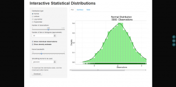
Interactive Statistical Distributions
workday training is a type of training that prepares individuals to use the Workday platform, which is a cloud-based human resource management software. This software can also be accessed through web applications, making the training relevant for individuals who want to learn how to use web apps for work.
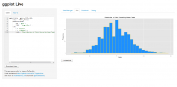
ggplot Live
Develop your ggplot2 code in a live environment, as well as downloadable code and plot files
Timeline of World War II
Display a visual timeline of events and leaders of World War II.
HomebrewR
Shiny app for exploring homebrew recipes and beer styles.
Twitter Popularity
Measuring popularity of people/objects on Twitter
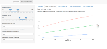
Power Eval
Enables interactive computation of the sample size required or evaluation of the power for a test.
Weather Compare
Compare historical temperature distributions across American cities.
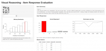
Item Response Evaluation
Review of responses with a difficulty distribution, item summary, and performance over time.
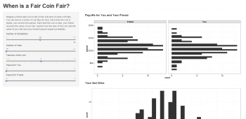
When Is a Fair Coin Fair?
Explore how the bias of the coin and the value of your bet and your friend’s payout explain probability.
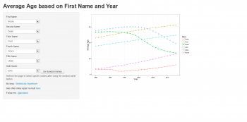
Average Age By Name
Choose a set of names, and see the average age of people with those names over time.
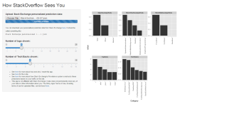
How StackOverflow Sees You
Visualize how StackOverflow sees you.
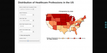
Healthcare Professions Map
Thematic maps of healthcare professions by state, using data from the US government Bureau of Labor Statistics database.
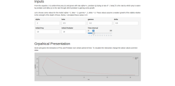
Predator Prey Model
The Lotka-Volterra equations, also known as the predator-prey equations.
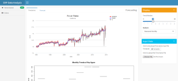
ERP Data Analysis
Forecasting & Time Series Decomposition. Lets users input & explore their time series data.
Heart Disease Classifier
The app uses a K-nearest neighbors algorithm to classify heart disease data available at the UCI repository
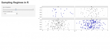
Sampling Regimes
Watch how different sampling methods select from different size populations.
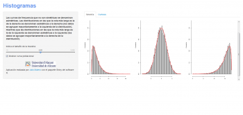
Histograms
Histograms demonstrating distribution symmetry and kurtosis (in Spanish)